DIY Crystal Bracelet Color Matching Guide: 4 Rules to Avoid a Cheap Look and Create Luxury Jewelry
You’ve carefully selected beautiful, meaningful natural crystals. Yet, when strung together, the result often feels less like fine jewelry and more like a craft project.
This is a common frustration. True luxury isn't about piling on expensive stones—it’s about the meticulous balance of color, texture, and light. To elevate your DIY bracelet from "homemade" to "high-end boutique," master these four rules of visual restraint.
01 / The Art of Negative Space
The hallmark of luxury is knowing when to hold back. Establish one dominant tone, then use highly transparent, colorless crystals (like Clear Quartz) as visual "breathing room" to avoid a cluttered look.
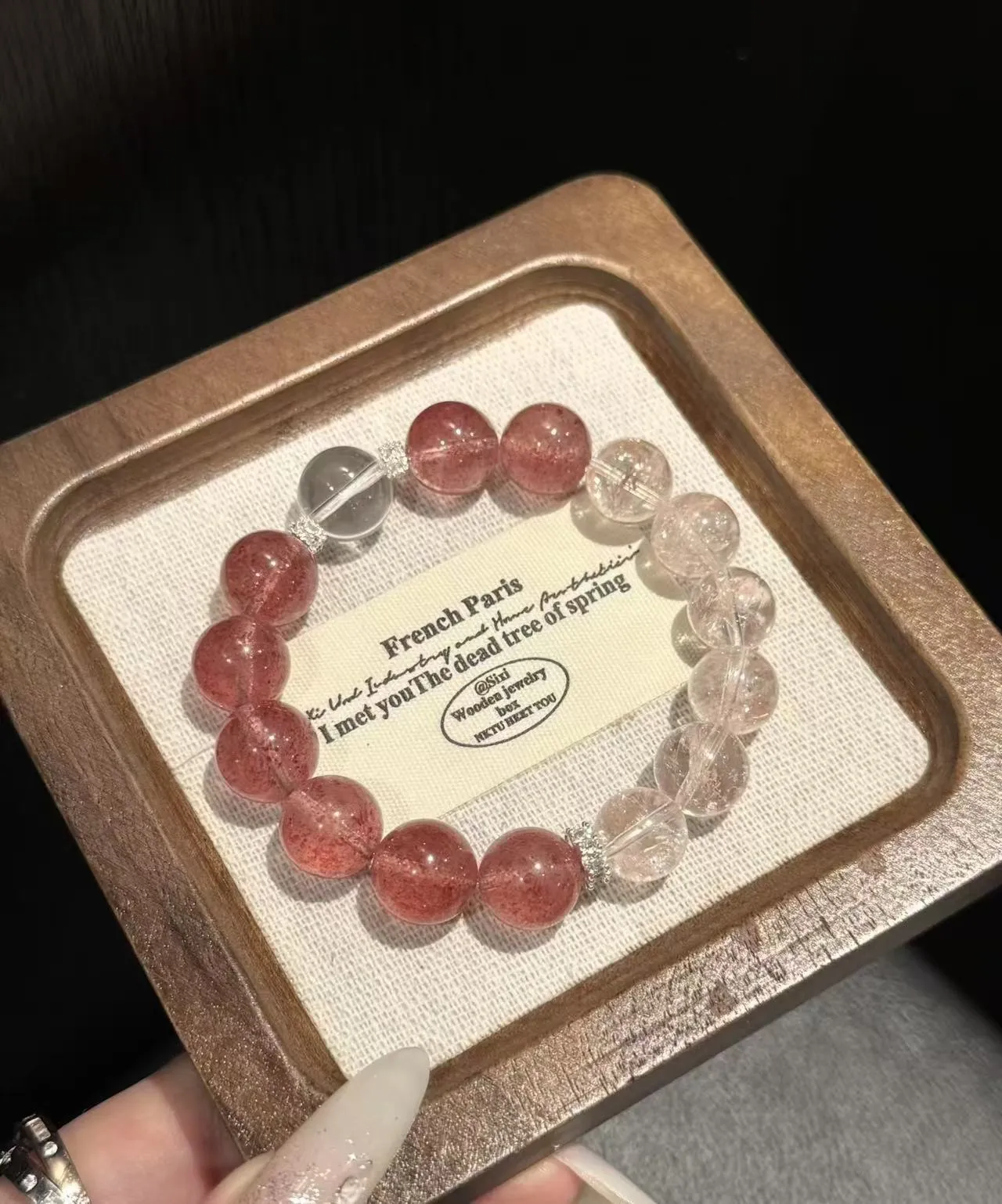
Like white space on a canvas, transparency neutralizes heavy textures. It allows your main stone—like the Strawberry Quartz above—to take center stage, creating an effortless, airy elegance.
Explore This Design02 / Tone-on-Tone Harmony
For a more dynamic look, pair stones that sit adjacent on the color wheel. Instead of randomly mixing beads, try a modern Color-Blocking approach by grouping cool tones into distinct sections.
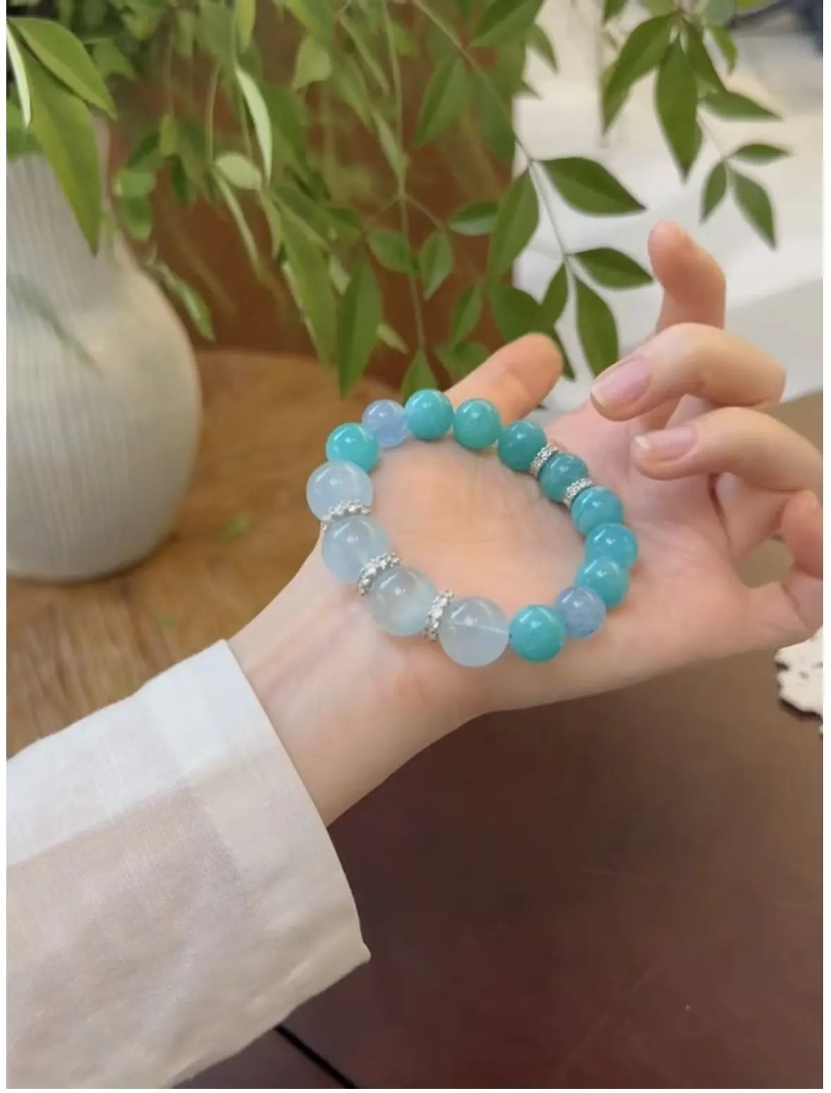
Explore This DesignThe Designer's Secret: Never split colors exactly 50/50. Play with asymmetry and varying bead sizes (e.g., pairing 12mm Aquamarine with 10mm Amazonite) to create a sophisticated visual tension.
03 / The Play of Light
Color is only half the story. The contrast in texture is what gives jewelry its expensive feel. The most direct method is introducing elements with completely different transparencies to collide.
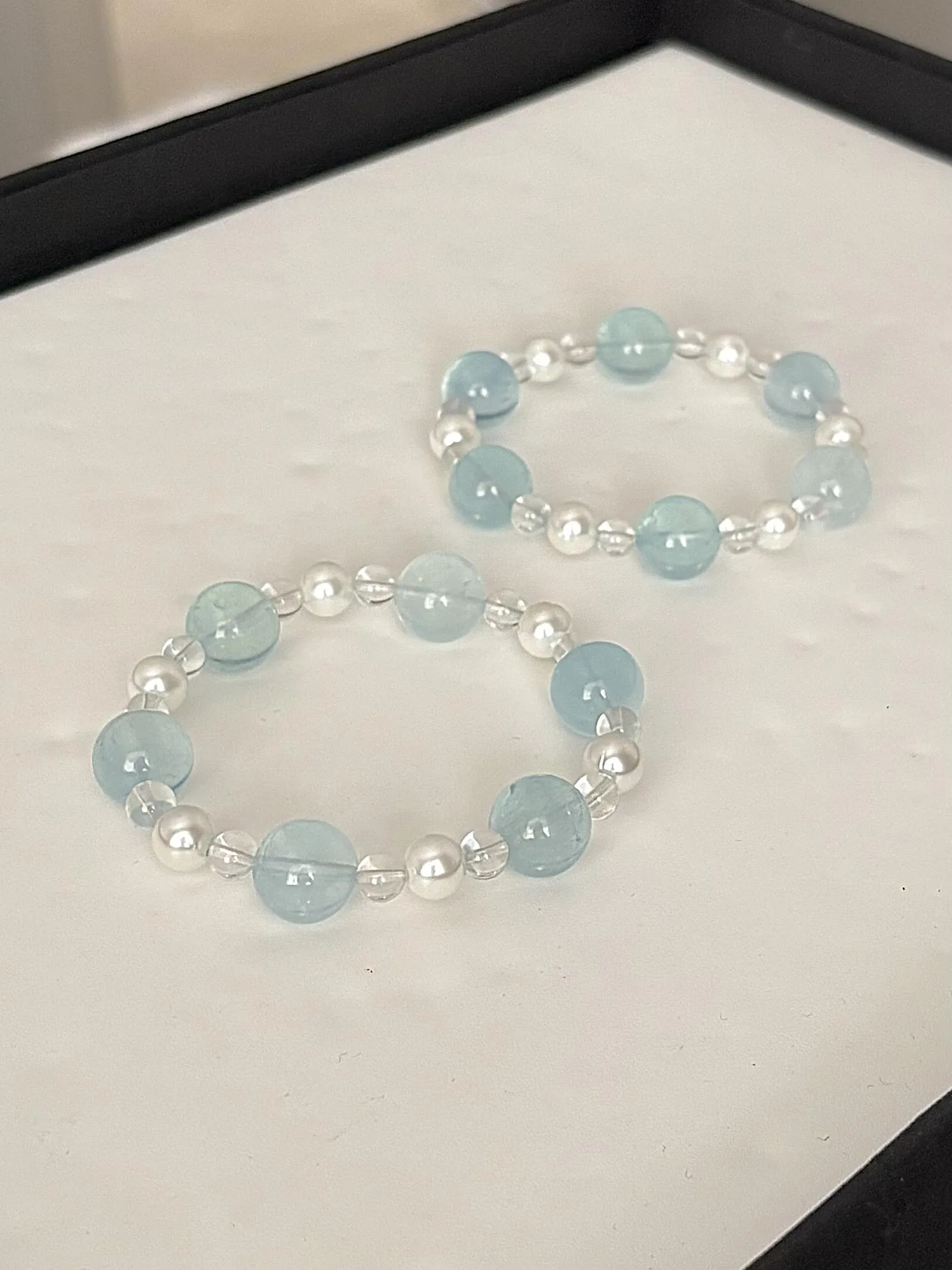
Pairing opaque materials (like classic pearls) with faceted, transparent crystals creates a stunning optical clash. The pearls provide a grounding, elegant weight, while the faceted Clear Quartz acts as a light-catcher, instantly lifting the heaviness and adding ethereal sparkle.
Explore This Design04 / Hardware Restraint
Metal accents are the dividing line between amateur crafts and boutique jewelry. Always opt for 14K Gold-Filled or 925 Sterling Silver to support a true luxury positioning.
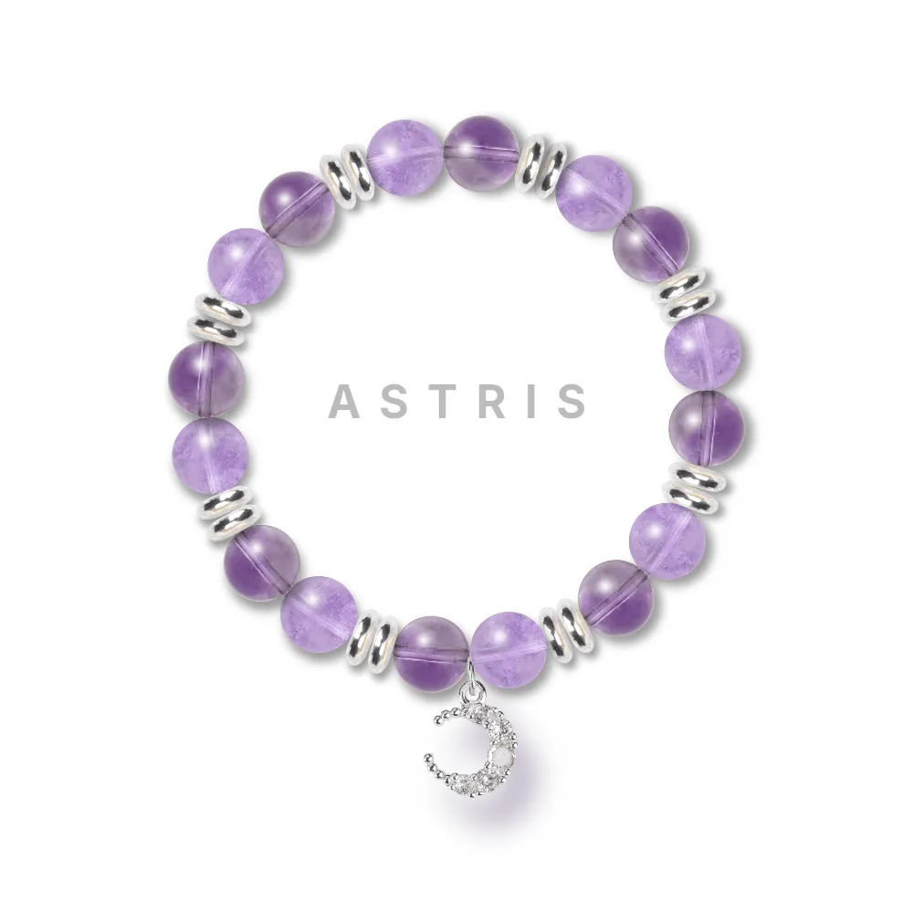
Rather than placing a metal spacer between every bead, use them rhythmically to frame sections or draw the eye to a delicate focal charm. This intentional pacing breaks the monotony and gives your design a curated, thematic finish.
Explore This DesignDesign Your Masterpiece
In high-end jewelry, less is always more. By embracing restraint and contrasting textures, you can design pieces that rival luxury boutiques.
Ready to bring your vision to life? At Astris, our online design studio lets you visualize these rules in real-time. Mix, match, and perfect your layout before making it a reality.